Picture your storefront on Amagansett’s Main Street: warm cedar shingles, crisp white trim, and a quiet confidence that never shouts. If you’re weighing bold brand colors or contemporary finishes, you may be wondering how far you can push it before design review pushes back. You’re not alone. In this guide, you’ll see why the classic shingle-and-white-trim palette works so well here, what boards tend to scrutinize, and how to present a refined, brand-right design that earns approval. Let’s dive in.
Why shingle and white trim work here
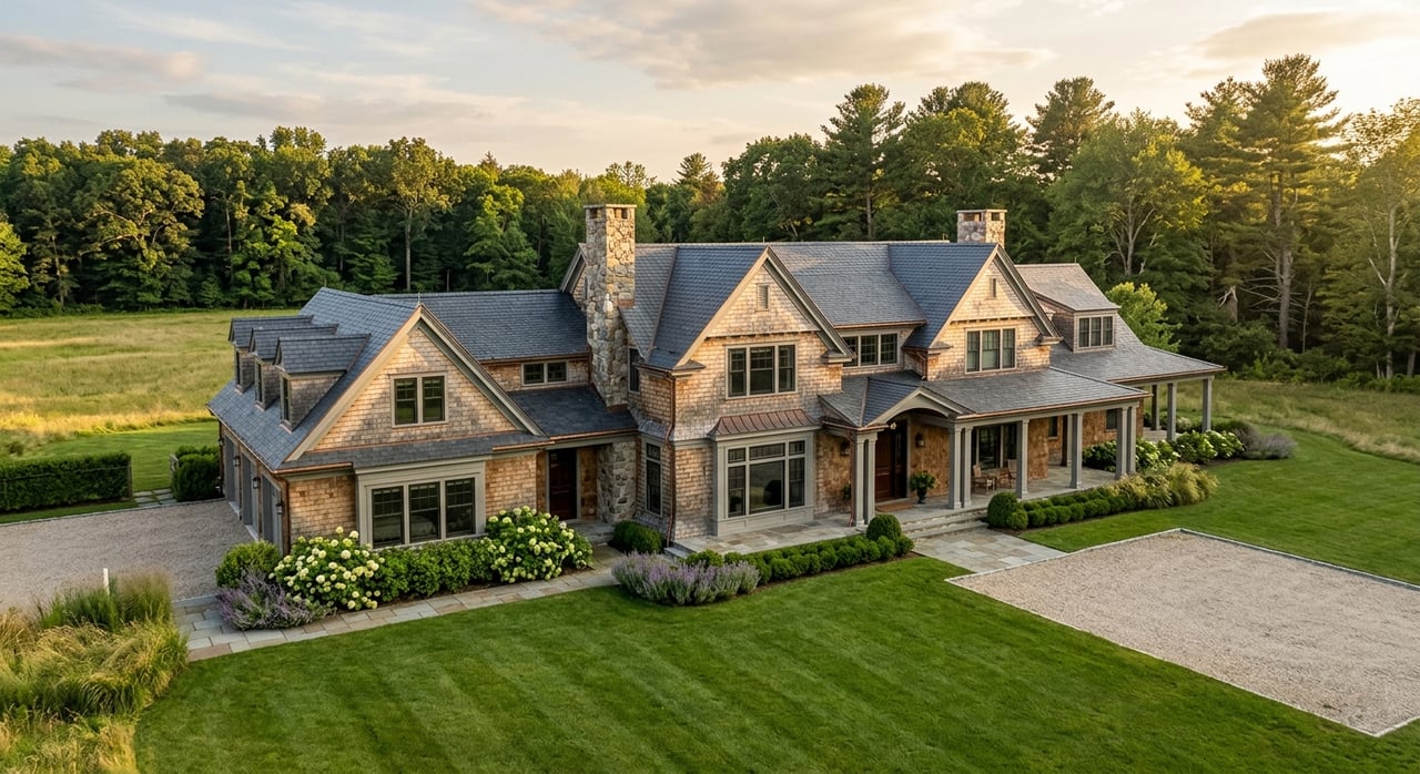
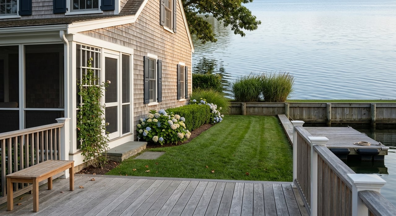
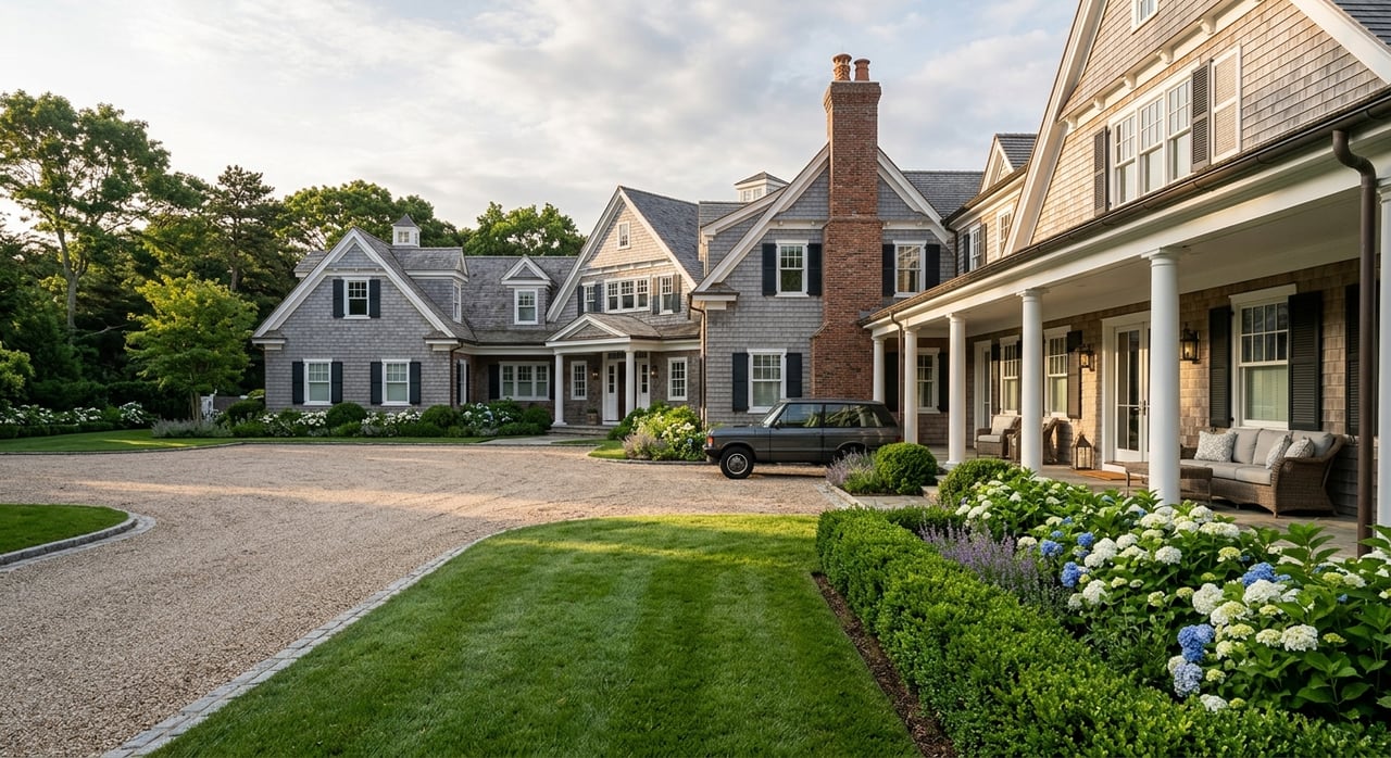
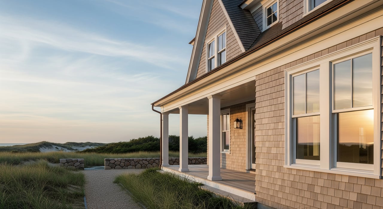
Built for the coast
Wood shingles, especially cedar, are well suited to coastal weather. They shed rain, ventilate, and weather to a natural gray that hides salt and sun wear. When installed with proper flashing, back-priming, and ventilation, they age gracefully. White-painted trim is easy to touch up and delivers durable contrast without heavy maintenance.
Calm, legible storefronts
White trim frames windows and cornices so your façade reads clean and orderly at a glance. On a small-town main street, restrained palettes reduce visual noise where many brands share the same block. Neutral siding with limited accents keeps the building’s proportions clear, so your signage and window displays can do the storytelling.
Cultural fit and market value
Amagansett’s Main Street draws from New England shingle style and coastal vernacular. Visitors and locals read that look as authentic and high value. In heritage and resort contexts, the familiar combination of natural shingles and white trim feels right at home, which can help approvals and long-term property appeal.
What review boards look for
Brightness and saturation
Highly saturated or fluorescent colors often dominate the streetscape and trigger objections. If you love a strong brand color, reserve it for smaller elements like a door, an awning valance, or a sign field. Muted tones tend to go farther in review.
Materials and finishes
Boards favor authentic or high-quality, textured materials that align with local precedent. Real wood for shingles and trim reads as compatible, while reflective metal panels or vinyl often face resistance. Matte or low-gloss finishes reduce glare and visual intensity.
Signs and light
Oversized or internally illuminated, flashing signs are common rejection points. Keep sign size aligned with cornice lines and window bays. External, shielded lighting or subtle halo illumination usually fares better than bright backlighting.
Color context and contrast
Neon trim against natural shingles or large, full-façade color fields tend to test the limits. White or off-white trim is usually acceptable because it reads as traditional. If you add accent color, keep it to a door, an awning, or a small sign band.
Multi-tenant consistency
When several tenants share a building, wildly different palettes create visual fracture. A building-level base palette of shingles and white trim with a small, pre-selected accent range helps tenants express brand while keeping cohesion.
Precedent and documentation
Boards often reference nearby precedents. Show how your proposal relates to buildings on and near Main Street. Complete, well-labeled packets with physical color chips, material samples, scaled drawings, and context photos speed up review.
Keep your brand and meet the standard
Use color with intent
- Place brand color on touchpoints: the entry door, awning edge, or a painted wood signboard.
- Choose desaturated versions of bright hues to reduce visual impact while staying on-brand.
- Let product displays and interior lighting provide vibrancy visible through windows.
Build with authentic materials
- Lead with natural shingles and painted wood trim. Add small areas of matte metal or painted wood for logos or address numerals.
- Use woven awning fabrics or natural-texture sign panels for subtle interest instead of large flat color blocks.
Light for mood, not glare
- Select warm, shielded fixtures that wash façades gently and highlight signage legibly.
- Avoid bright, internally lit panels that read as out of character on traditional streets.
Acceptable compromise examples
- Natural shingles + white trim + a single branded door color.
- Natural shingles + a muted brand-color signboard in low-gloss paint.
- Neutral façade + branded awning or limited window vinyl that is reversible.
Your ARB prep checklist
Before submitting, confirm the correct review body and deadlines for Amagansett. Assemble a complete packet so the board can evaluate quickly and fairly:
- High-resolution paint chips and physical swatches with manufacturer name and formula.
- Material samples: shingle species, trim profile, sign substrate, awning fabric.
- Scaled elevations showing existing and proposed conditions.
- Photographs of the building and the adjacent context on Main Street.
- Signage drawings with size, placement, illumination, and mounting details.
- Lighting plan with fixture specs, color temperature, and shielding.
- Mockups or photos of similar, approved treatments as precedents.
- Maintenance plan outlining repaint cycles, fabric longevity, and finish specs.
- Early outreach: request a pre-application staff meeting or site visit to surface concerns.
Make approval easier
Communicate context clearly
Explain how your materials, palette, and sign scale reference local precedents. Present in-situ mockups or photosimulations so reviewers can gauge the actual street effect. Keep the palette limited and note which elements are reversible.
Address maintenance and longevity
Provide repaint schedules and replacement timelines for awnings and finishes. Specify UV-stable pigments and low-gloss coatings. Emphasize that traditional materials and restrained palettes minimize visible wear and reduce long-term costs.
Key sources to consult
- National Park Service guidance, including the Secretary of the Interior’s Standards and Preservation Briefs for compatible materials and finishes.
- Main Street America design resources for storefront scale, signage, and awnings in historic districts.
- Historic New England references on shingle-style architecture and color palettes.
- Manufacturer historic color collections to identify desaturated, context-friendly tones.
- Wood shingle performance literature from the US Forest Service or manufacturers for species selection and maintenance.
- Town of East Hampton planning, historic preservation, or ARB materials and recent meeting minutes for local precedents and application requirements.
The case for restraint
When you look down Amagansett’s Main Street, the rhythm of shingles and white trim creates visual continuity. That calm backdrop is not an accident. It is a shared language that lets each storefront signal brand with small, precise moves. If you anchor your design in authentic materials, quiet finishes, and scaled signage, you can express identity and still earn quick, favorable reviews.
If you’re considering a storefront purchase or planning upgrades ahead of review, let’s talk about strategies that protect value and speed approvals. Work With Us at Unknown Company to align your property with local expectations while keeping your brand front and center.
FAQs
What is the prevailing storefront look in Amagansett?
- Natural wood shingles that weather to gray, white-painted trim, simple massing, and restrained color accents are common. This palette supports a cohesive Main Street and reads as authentic to residents and visitors.
How can I use a bold brand color without risking rejection?
- Limit saturated color to smaller elements like a door, awning valance, or sign panel. Consider a muted version of your brand hue and keep finishes matte or low gloss.
Which materials and finishes are more likely to be approved?
- Real wood shingles and painted wood trim with matte or low-gloss coatings typically align with local precedent. Avoid reflective or synthetic-looking materials and oversized, internally lit signs.
What should my ARB submission packet include for a new façade?
- Physical color chips, material samples, scaled elevations, context photos, signage and lighting details, mockups, and a clear maintenance plan. Early staff check-ins can streamline feedback.
How do multi-tenant buildings manage different brands on one façade?
- Establish a shared base palette, such as shingles and white trim, and a small, pre-approved accent range. Each tenant selects from that range for consistent, context-friendly variation.